The world’s major design museums tend to treat architecture as part of the collection. At places like the Vitra Design Museum in Weil am Rhein, the Design Museum in London, and Cooper Hewitt, Smithsonian Design Museum in New York, the building is not a neutral shell wrapped around exhibitions. It carries the institution’s identity, shapes visitor movement, and frames how design itself is understood.
Each museum approaches that idea differently. Frank Gehry’s Vitra museum turns circulation and daylight into sculptural form. London’s Design Museum uses the dramatic shell of the former Commonwealth Institute to create a sequence of open, theatrical spaces beneath a soaring concrete roof. Cooper Hewitt folds contemporary exhibition systems and digital interaction into the preserved fabric of the Andrew Carnegie mansion, allowing historical interiors and modern technology to coexist without obvious friction.
What links them is a shared concern with choreography. Light, movement, materials, graphics, and sequencing are treated as part of the exhibition language. Visitors are not simply moving between rooms. They are moving through a designed narrative.
Vitra Design Museum, Germany
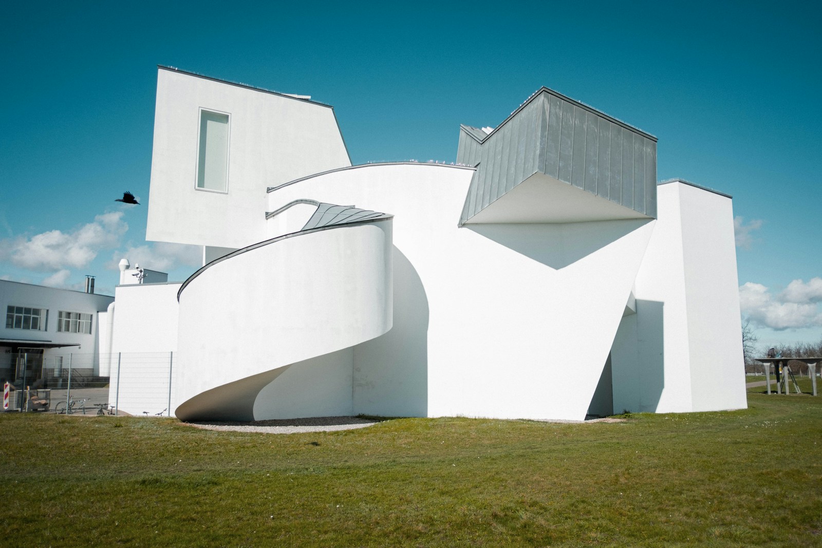
The Vitra Design Museum announced itself as an architectural statement from the moment it opened in 1989. Gehry’s composition of white plaster volumes, angled towers, ramps and zinc-clad roofs feels less like a conventional museum than a fragmented object assembled in motion. Yet beneath the apparent spontaneity, the geometry is tightly controlled by practical requirements: gallery height, circulation, daylight, and structural logic all drive the form.
The museum’s exterior remains one of Gehry’s clearest demonstrations of architecture functioning simultaneously as sculpture and container. The building appears restless from outside — pitched roofs intersect, stair towers jut outward, walls tilt and compress — while the interior resolves into a surprisingly restrained set of galleries. Four exhibition spaces sit within a relatively simple organisational framework centred around a cruciform skylight that cuts daylight deep into the building. That skylight also becomes an external marker, visible on the roofline as part of the composition itself.
Inside, the atmosphere changes completely. The galleries are sparse and controlled: white walls, pale floors, minimal detailing, carefully diffused natural light. The architecture withdraws enough for furniture, industrial objects and prototypes to take focus. Gehry’s more expressive gestures are pushed outward toward circulation towers and roof forms, leaving the exhibition rooms closer to the “white cube” tradition associated with contemporary art galleries.
That tension between expressive exterior and neutral interior is central to the building’s success. The museum behaves as an icon without overwhelming the work inside it.
Circulation is relatively direct. Visitors move across two floors connected through diagonal stair towers and compact transitional spaces. Orientation rarely becomes difficult despite the irregular exterior massing. The route feels composed rather than maze-like, with framed moments of compression and release as daylight shifts across walls and ceilings.
The museum also functions as part of the wider Vitra Campus, where architecture operates almost as a curated collection in itself. Herzog & de Meuron’s VitraHaus now acts as the main public entry point, combining reception, retail and hospitality spaces. Nearby, the Schaudepot extends the museum’s presence by exposing archive storage and collection infrastructure rather than hiding it. Glass walls, visible shelving systems and an even grid of ceiling lights reinforce the sense that preservation and display are continuous activities rather than separate functions.
Landscape plays a quieter role but follows the same logic. Piet Oudolf’s perennial planting softens the campus without competing visually with the architecture, allowing the buildings to remain dominant while avoiding the sterility often associated with design campuses.
Materially, Vitra stays restrained throughout: white plaster, zinc, concrete, glass, pale wood. Branding and signage follow the same approach. Graphics remain understated, maps are simple, and visual identity never competes for attention. The museum’s confidence comes from spatial clarity rather than graphic saturation.
Design Museum London, UK
London’s Design Museum occupies a very different architectural situation. Rather than commissioning a new icon, the institution moved into the former Commonwealth Institute in Kensington, a landmark modernist structure completed in 1962. The defining feature is its extraordinary hyperbolic paraboloid roof — a thin concrete shell that rises and dips like stretched fabric.
OMA and Allies & Morrison oversaw the conversion, while John Pawson designed the interiors. Their approach avoided turning the building into either a preservation project or a complete reinvention. Instead, the renovation works through contrast. The dramatic roof remains intact and dominant, while the interiors are stripped back into a controlled palette of pale surfaces, oak panelling, glass and concrete.
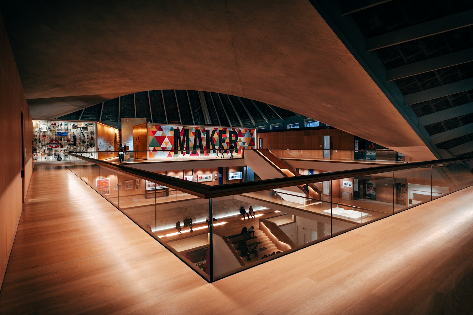
Pawson’s central intervention was the creation of the large atrium beneath the roof. The space feels simultaneously monumental and calm. Tiered oak seating wraps around the void, staircases cut diagonally through the volume, and the roof hovers overhead as a continuous sculptural surface. Visitors become part of the composition simply by occupying the space.
The atrium also reorganises circulation. Entry happens through a bridge-like threshold leading directly into the centre of the building rather than along a conventional linear route. From there, visitors decide where to go next. Galleries unfold around the atrium perimeter, allowing multiple paths instead of a prescribed sequence.
That decision changes the museum psychologically. Rather than being guided room by room, visitors orient themselves spatially first. The building encourages wandering, return journeys and cross-views between exhibitions.
The exhibitions themselves often exploit these sightlines. Large thematic shows extend across floors and remain visually connected through the atrium void. Installations, banners and suspended graphics frequently interact with the architecture instead of sitting passively within it. Even temporary interventions tend to acknowledge the building’s geometry.
Material consistency helps hold this complexity together. Oak becomes both furniture and architecture. Pale stone floors and white walls create continuity between galleries, circulation zones and gathering spaces. Light entering through the roof amplifies the sense of openness without flattening the atmosphere.
Wayfinding and graphic identity were redesigned with equal care. The museum’s typography and signage system deliberately align with Pawson’s restrained interiors. Information is clear but quiet. Directional graphics sit comfortably within the architecture instead of functioning as separate visual layers competing for attention.
That balance between clarity and restraint matters because the building itself already carries substantial visual weight. The museum avoids adding unnecessary graphic noise, but the building becomes part of the museum exhibition.
Cooper Hewitt, Smithsonian Design Museum, USA
Cooper Hewitt approaches the relationship between architecture and exhibition from almost the opposite direction. Rather than creating a new sculptural object, the museum works within the highly detailed interiors of the Andrew Carnegie mansion, completed in 1902. The challenge was not how to add drama, but how to introduce contemporary exhibition systems without destroying the character of the historic building.
The renovation handled this with unusual precision. Original mahogany panelling, marble surfaces, fireplaces and decorative detailing were retained, while modern infrastructure was folded quietly into the architecture. Hidden doors, pivoting wall panels and discreet technological interventions allow galleries to shift function without drawing attention to the mechanics behind them.
New exhibition elements are deliberately crisp and minimal. White vitrines and display systems sit against the darker historic interiors, creating a clear distinction between old fabric and contemporary insertions. The contrast works because neither side attempts to imitate the other.
Circulation remains closer to the logic of a mansion than a purpose-built museum. Visitors move through corridors, staircases and interconnected rooms rather than large open galleries. That produces a more fragmented experience, but also a more intimate one. Exhibitions unfold in episodes rather than grand sequences.
Digital interaction becomes the museum’s major organising tool. The “Pen” system allows visitors to collect objects digitally throughout the visit and revisit them later online. Interactive galleries like the Immersion Room turn viewers into participants, using projection and responsive technology to transform archival material into something spatial and active.
Unlike Vitra or London’s Design Museum, daylight plays a less dominant role here. The mansion’s windows provide atmosphere, but exhibitions rely more heavily on controlled LED lighting, projections and screens. Artificial light becomes part of the interpretive system rather than simply a technical necessity.
Pentagram’s identity and signage system follows the broader architectural strategy. Graphics are contemporary and precise, but restrained enough to sit within the historic setting without feeling imposed on it. Typography, labels and digital interfaces feel integrated rather than layered awkwardly onto the building.
What makes Cooper Hewitt distinctive is the way it treats historical architecture not as a frozen artifact but as active infrastructure. The mansion remains recognisably domestic in scale and character, even while functioning as a technologically advanced museum environment.
Shared Strategies and Persistent Tensions
Despite their differences, the three museums arrive at several common conclusions about what a contemporary design museum should be.
First, none of them treats architecture as background. The building itself becomes part of the exhibition narrative. Gehry’s fragmented forms at Vitra, the immense roof volume in London, and Cooper Hewitt’s layered historic interiors all shape the visitor’s understanding before any object is viewed.
Second, all three balance permanence against adaptability. Each building has a strong architectural identity, yet each must accommodate constantly changing exhibitions. The solution is usually to stabilise certain elements — circulation, material palette, structural form — while keeping gallery systems flexible.
They also share an interest in choreographed movement. Visitor circulation is never purely functional. Stairs, bridges, atriums and corridors are treated as moments of staging and orientation. Architecture guides attention without relying entirely on signage.
Material choices reinforce institutional identity in similarly deliberate ways. Vitra’s white plaster and zinc support its controlled modernism. London juxtaposes warm oak against the cool precision of concrete and glass. Cooper Hewitt preserves rich historical textures while inserting luminous contemporary surfaces.
The museums differ most sharply in how they position technology. At Vitra, architecture itself remains the dominant medium. London balances architectural drama with flexible exhibition infrastructure. Cooper Hewitt places digital interaction much closer to the centre of the visitor experience.
Still, all three ultimately work toward the same idea: the museum as a designed environment rather than a passive container. Architecture, graphics, lighting, circulation and exhibition design operate together as a single curatorial system.
Visitors leave remembering not only the objects on display, but the spaces that framed them.