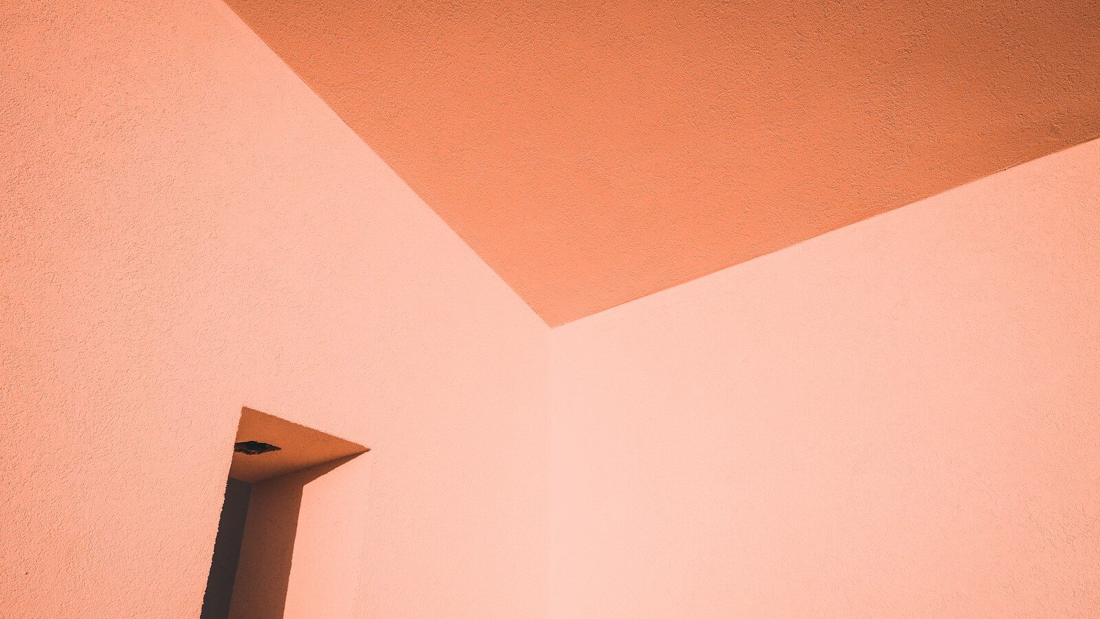
We’ve seen plenty of trends come and go. Some make sense for a few months, then fade when the next round of colour charts lands. But every so often, something stays. Not because it’s flashy, but because it changes how a room feels. That’s what colour capping does.
It isn’t complicated once you’ve seen it in person. Picture a gentle shift of tone rising up your walls. A mid shade that deepens as it reaches the ceiling so the eye naturally follows upward. The effect is calm, tonal, and oddly satisfying. Everything feels in balance. You could call it the quieter cousin of colour drenching. Less about drama, more about harmony.
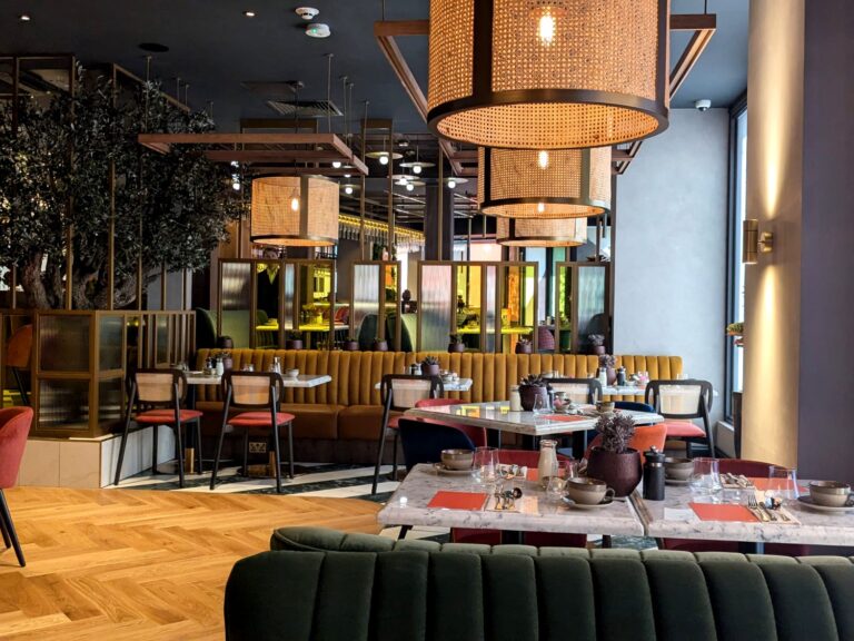
At Orka Interiors, we’ve been trying this technique in a few homes across the UK and it’s easy to see why it’s tipped to be big in 2026. There’s something quietly clever about it. Instead of leaving the ceiling to sit there like a blank white lid, you give it a role in the design. In older houses with cornices or picture rails, the effect draws attention to the craftsmanship. In newer builds, it brings warmth to spaces that might otherwise feel flat.
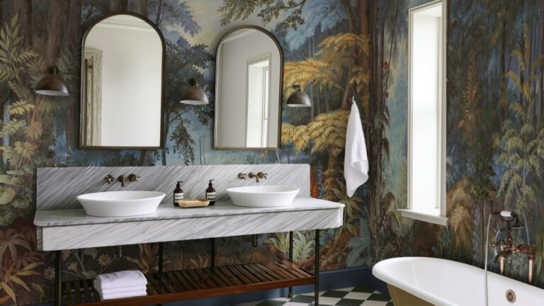
We’ve noticed it works best in rooms where you want to soften the atmosphere. Bedrooms, living rooms, study corners. One project in Sheffield used a muted sage that climbed to a mossy olive near the ceiling. By day, the light moved across the shades in slow, shifting bands. By night, it felt enclosed in a good way. Peaceful.
Thing is, it’s never just about the paint. To really make it work, you need the rest of the room to join in. Carry the tones through in fabrics and finishes. Maybe a velvet sofa that nods to the ceiling shade, or brushed brass lamps that bounce the colour gently around. The layers make it feel deliberate. Without them, it can look a bit unfinished.
If you’re planning to try it yourself, start with a neutral palette. Clay, mushroom, chalky cream. Choose two or three shades from the same family and use the deepest one just at the top where the wall meets the ceiling. Finish matters too. A low sheen overhead can help light travel, especially in smaller spaces.
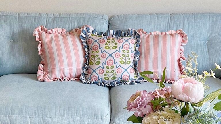
That said, it isn’t right for every room. In small spaces with low ceilings or very little natural light, colour capping can make things feel tighter. In those cases, echo the idea through accessories instead. Cushions, artwork, maybe ceramics that pick up the same tones. You’ll get the same sense of flow without losing the feeling of space.
What we like most is how adaptable it feels. Whether you’re working with a Victorian terrace in Manchester or a modern flat in London, the approach fits in. It feels current but not shouty, stylish without being expensive to achieve. And unlike the statement wall craze from a decade ago, colour capping makes sense. It respects proportion, light and mood all at once.
We’ve always believed that good design doesn’t need to shout. It just has to feel right. Colour capping does exactly that. A small shift that changes everything.
Orka Interiors is a UK-based interior design studio specialising in bespoke interior design and colour consultation